On Recreating a 90s Email Client
Lovingly recreating something few people remember.

How to make remake a 90s email client in one easy step:
- Step 1: Ask your friend Jesse to do it.
It can feel so exciting when you realize the creators of a particular piece of media have taken the time to get the details right; the thing they are especially if meticulous about is a favorite subject of yours. It's like a shared secret between the two of you. So when it came time to show Sam and Allison's email exchange, we knew it was an excellent opportunity to make early web folks happy.
I asked Jesse if he wanted to take a crack at nailing down as many period accurate details as possible, and he went way above the call of duty. So much so I asked him to share his process with all of you. It's a fantastic story:
Hey everybody, Jesse Holden here. I'm arriving a bit late, but I wanted to follow up on Matt's Jan 30 post where he introduced me as a collaborator on Incredible Doom and asked me to talk about the PINE screens a bit!
First, though: it feels so awesome to be working on this with Matt and seeing how quickly it all comes together. We've had so many overlapping orbits -- the Portland XOXO community, working a day job together, comic conventions -- that in hindsight it seems inevitable that sooner or later we'd stumble over a perfect project to collaborate on. When Matt brought me into a room with a bunch of index cards pinned to the wall and laid out the scope and ambition for Incredible Doom, I thought to myself, this is the most exciting thing I’ve ever worked on. Since then we've been meeting all the time and writing, planning, speculating, reminiscing, acting out scenes, and generally getting super into this. Story elements draw deep from both of our own lives so I feel close to this material in a way I never have before on a project.
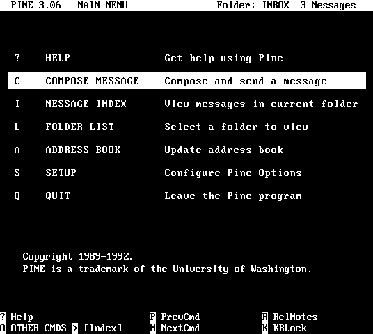
So, I'll spare you my life story, but PINE was the email program we used at my first (real) job, and I never forgot the look & feel of that pre-point-and-click email interface. When we were brainstorming on era-appropriate tech signifiers for Incredible Doom, my mind leapt right to it. (Matt deserves credit for the others; I love the touches like Allison's monitor stand/power center and her floppy disk rolodex — *everybody* had these.) But if we were really going to use PINE for Sam's computer, I decided I had to get the small touches right. In other words, I had to ridiculously overthink it, which is a thing I do.
What follows is a borderline-pathological deep dive on the process of mocking up a few computer screens for a comic, so if that's not your cup of tea then no worries! I promise I won't be leaping into your feed constantly to do this :)
So since this segment is how Sam is introduced into the story, we decided all the screens would be from his "point of view" -- meaning that Sam's emails would be seen in Compose Email windows and Allison's would be received in his Inbox, which adds some subtle visual cues about the back-and-forth. Then at the end of the exchange, once we've already learned a little about him from the textual exchange, we could "zoom out" of the screen and see Sam himself for the first time in his bedroom.
Sitting down to actually make these, it hit me how information-dense these screens are in 1992 -- I had to decide *everything*. What OS was he on? What version? We'd already figured out the exact date this exchange would happen (for reasons TBA), but what exact time of day or night is it when he logs in, and how long should elapse between each email? Heck, what're their email addresses? Some of these have story effects, and others just felt important to "get right" from a character standpoint or technical-historical reasons.
I started with the version of PINE that he would've used in November 1992 -- the University of Washington has great records of PINE history, so it looked like if he were up to date on patches it would've been 3.06. And Wisconsin Unix 4.3+NFS would have been out at that time and runs PINE, plus I had some reference screenshots of that particular version, so I figured that'll do fine for an OS. Handily, I had an appropriate typeface to use as well: Perfect DOS VGA 437 by Zeh Fernando.
So that got me as far as the emails themselves. Before ubiquitous free webmail like Hotmail, Gmail, etc came along, there were a couple available options that us kids could use to get an email addresses. One was to use the free email account our dial-up ISP gave us. Among my short list of made-up ISP names, "zephyrtech” best conjured the idea of some geeks running a small town's first private ISP in 1992, so it seemed to fit as a provider for Allison. The other way would be finding a company that partnered with a local campus to give students (and others) email accounts, and so Sam's got himself on "campuslink". In either case they would have used the ".net" TLD back when such things still had some trace of semantic meaning, and in both cases your account name was much more likely to be something like "john.doe" or "j.doe" as opposed to something like "DiRtY_AnGeL_69@hotmail.com", the regrettable likes of which came to prominence among dumb kids like me a few years later, as heralded by disposable webmail accounts. So, s.omid@campuslink.net and allison.r@zephyrtech.net it was. They're not real addresses, by the way, so please don't email our characters!
What would Sam's initial subject line be? As a teenager I'd always use snippets of song lyrics that seemed in the moment to be clever or profound... especially if I was trying to impress a girl. Here in these emails we had Sam talking about checking out a Daniel Johnston album on her recommendation, so a line from "King Kong" ("they thought he was a monster...") seemed like something he might use as a wink and a callback, and also allowed me to sneak some super obtuse foreshadowing in as well.
We had the idea of giving one or two specific lines a big 'pop-out' effect in their own panel as they hit Sam in the moment, and I mocked up some ideas for how a very close-up CRT display showed text -- the way the shadow mask & dot pitch carved up the individual pixels, the way the glass diffused the light and gave text a soft glow, and how scanlines & flicker added animation. Limits in the Patreon CMS meant I couldn't go hog-wild within the post you saw, but we're exploring some ways future digital versions might incorporate some of these effects. You can check out an original animated panel here.
Aside from nixing animation and flattening the colors, we made some other small concessions to the format which I think all work. One was using the block cursor for an insertion point glyph -- not necessarily OS-accurate, but more effective at clarifying where Sam is typing in each screen. I also made each email reply increment the subject line, so replying to "Re: Topic" makes the subject "Re(2): Topic" -- a quirk of some early email clients that I can't confirm was normal in PINE but which served both to A: make me nostalgic for old email quirks and also to B: create some linearity to the conversation. And deep UNIX geeks are likely to twitch a bit over Sam typing out "/usr/bin/pine" to launch PINE (he could have just typed "pine"), although my thinking was that it seemed slightly clearer to the reader that he was opening a program, and also recalled my teenage days of doing things the more complicated way in order to feel more tech-savvy about myself. And due to the constraints of the page, one column of keyboard shortcuts had to be omitted from the bottom of each Inbox and Compose screen in PINE, so my heartfelt apologies to anyone who desperately needed to be reminded of PINE's Prev Page and Next Page shortcuts. :)
Hours before those pages posted, I realized that (even though I'd double-checked that on Nov 19, 1992 it wasn't daylight savings time where Sam and Allison live) I had forgotten to change the GMT offset in the email headers, and that according to the screenshots they were actually in South African Standard Time. Since relocating them to South Africa would have required a pretty dramatic story rewrite, I snuck a last-second hotfix into the project dropbox that corrected them to EST just before the pages got posted. Realistically it's hard to imagine anybody actually noticing or getting confused by that, but these are the things that help me sleep at night.
I'm extremely excited about where their story goes from here. Like I said, this is the most exciting project I've ever worked on. We have a lot in store and I really, really hope it connects with you.
Thanks!
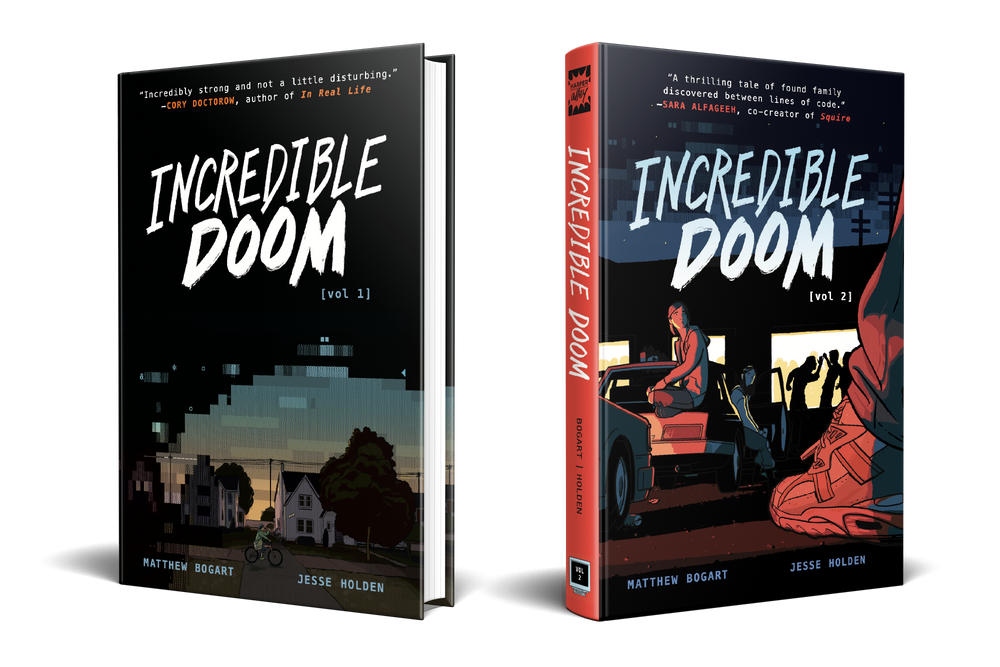
Want to see how these painstakingly recreated PINE screens look in the finished comic? Read Incredible Doom now.